A Data Love Letter to the NYC Subway
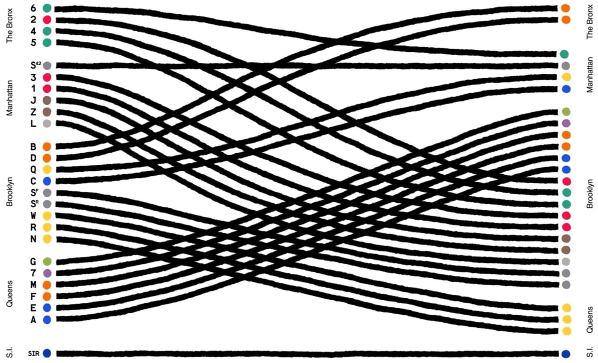
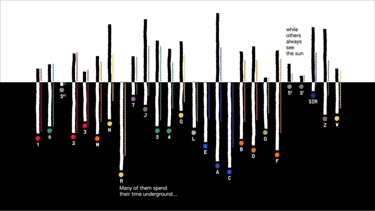
Giorgia Lupi and her team at Pentagram have created a data-driven animation for the MTA called A Data Love Letter to the Subway.
More from Lupi (who calls this an “absolute dream project”):
The project, “A Data Love Letter to the Subway,” visualizes each train line as a character whose unique qualities are extracted from MTA data. Data like length, location, and transfers were abstracted into train behaviors and attributes. Imaginatively animating each train line’s age, length, and path, we wrote a poetic story that explores the trains’ interwoven encounters with commuters and one another.
Our “Love Letter” draws on the elemental nature of picture books to unpack the visual system of the subway with curiosity and wonder. Drawing from the MTA’s Open Data Program, with my team we translated train data into a narrative made of attributes and behaviors, providing a rich view of the interactions, roles, differences, and the connections made and sometimes missed within the subway ecosystem.
Maps, NYC, the subway, data visualization…I am not sure how much more in my wheelhouse a thing could be.
Tags: design · Giorgia Lupi · infoviz · maps · NYC · subway · video
Comments 0
No comments yet. Be the first to comment!