The Red Onion Font
The latest post from The Pudding starts off about as good as possible to attract the likes of me: “This is a project about onions and math.” I mean, yes. I’m in. And I enjoyed the interactive article, Dicing an Onion the Mathematically Optimal Way, but the design was absolutely delightful and onion-y:
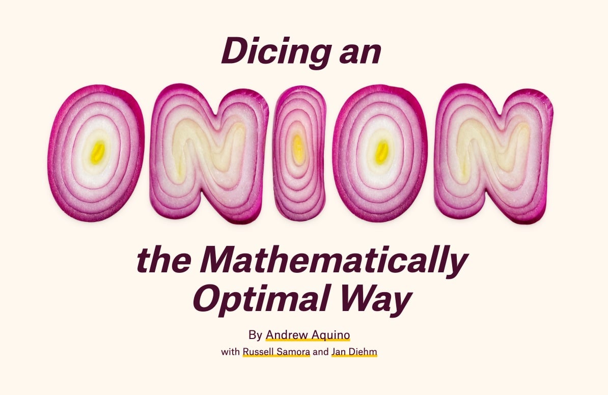
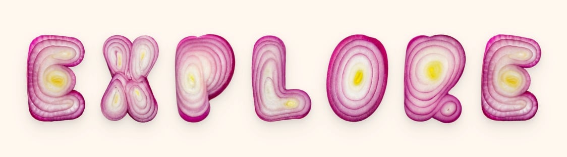
They even used an onion gradient for the border of the page. This must have been so fun to work on! Initially, I thought they’d designed the onion font, but a quick search turned up Handmadefont’s OnioType Font:
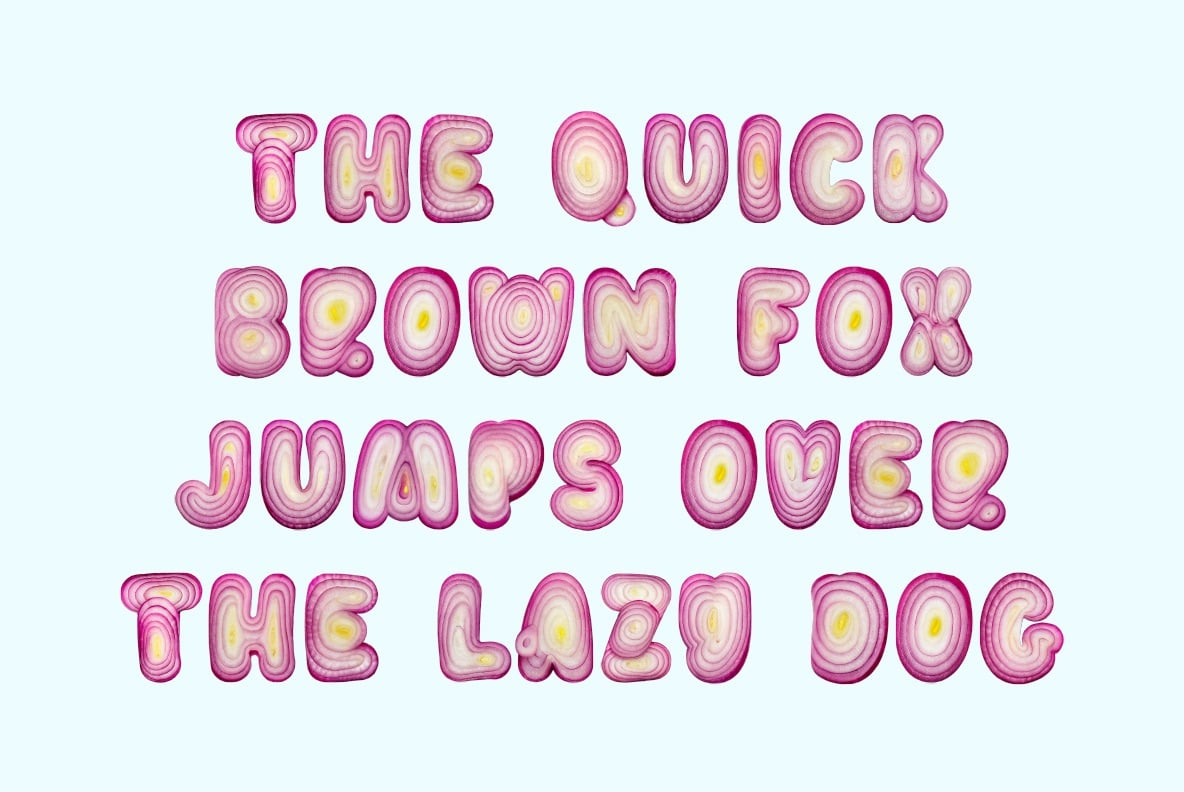
From the description, it sounds like the letterforms are made from real onions:
Each letter is lovingly crafted from a perfectly sliced red onion, where nature’s concentric rings do most of the design heavy-lifting. Vivid purples, tender whites, and sudden flashes of yellow form shapes so unexpectedly elegant, you’ll never look at a salad the same way again.
But I dunno…Photoshop might be a better guess. Still! I love this font and kudos to The Pudding for putting it to good use.
Tags: cooking · design · food · infoviz · mathematics · The Pudding · typography
The latest post from The Pudding starts off about as good as possible to attract the likes of me: “This is a project about onions and math.” I mean, yes. I’m in. And I enjoyed the interactive article, Dicing an Onion the Mathematically Optimal Way, but the design was absolutely delightful and onion-y:
They even used an onion gradient for the border of the page. This must have been so fun to work on! Initially, I thought they’d designed the onion font, but a quick search turned up Handmadefont’s OnioType Font:
From the description, it sounds like the letterforms are made from real onions:
Each letter is lovingly crafted from a perfectly sliced red onion, where nature’s concentric rings do most of the design heavy-lifting. Vivid purples, tender whites, and sudden flashes of yellow form shapes so unexpectedly elegant, you’ll never look at a salad the same way again.
But I dunno…Photoshop might be a better guess. Still! I love this font and kudos to The Pudding for putting it to good use.
Tags: cooking · design · food · infoviz · mathematics · The Pudding · typography
Comments 0
No comments yet. Be the first to comment!